Thursday, 16 December 2010
Wednesday, 8 December 2010
Friday, 3 December 2010
Magazine Front Cover Research
In order to create a well-designed, effective magazine front cover for promoting our film, i looked into other film magazine covers. By doing this i gained an understanding of the forms and conventions of movie magazines, and used and developed some of the visual aspects of the covers in my own cover.
Friday, 12 November 2010
Script
Good Intentions Trailer Script
Sara Jennings (non diegetic monologue): “I never did like camping… especially without mum and dad… “
Mary Jennings: “Bye honey”
Bernard Jennings: “Be safe”
Sara Jennings (non diegetic monologue): “But I never thought it would turn out like this…”
Darren: “Aright lads it’s getting dark, lets set up here and get this party started!”
Darren and friends: various, unspecific banter
Patricia Rigby: “What was that?”
Simon Jones: “Where’s Sara?”
Darren Jennings: “Have you seen a little girl?”
William Fyles: “No”
Sara Jennings: Heavy breathing
Monday, 8 November 2010
Titles
Titles
The Forgotten Life
This is in reference to how the antagonist has been forgotten from society, and is detached in this way, the bad side of this is it doesn't reference the main protagonist.
Father Death
This tackles the idea that the antagonist, William Fyles sees his relationship with Sarah as a father daughter dynamic but it is twisted by the death filled past.
Barbed Wife
This is in reference to the antagonists shady relationship with x wife. The problem is that the story doesn't revolve around this action.
Innocence
This is referencing both the innocence of the main girl and the innocence of the killer, who believes himself to be doing a just thing by capturing the girl.
Good Intentions
This is referencing how William Fyles, the antagonist sees his actions, but in reality there are morbid and disgusting.
Dementia
This title
Research Location Settings
Dan Rodriguez Revves
The location of horror films plays an integrel role in the generation of the atmosphere which is so definfing of a horror movie, due to the fact that our eventual horror trailer will have four diferent locations I will now research the salient conventions of the locations in contemporary horror movies.
Foreign
The Locations of horror movies are almost always foreign (just to make it clear, i do not mean that the location is in another country, though this can happen, I mainly am talking about a place in which the protoganist are not accustomed to) to the protagonists, this is done due to that facts that it creates an atmosphere in which anything could happen, so the audience will always be on edge as to what is about to happen. Though protagonistsare always foreigners in the location, there are always local inhabitants, these are often the antagonists, but not always. A good example of this foreign location plus local inhabitants dynamic is the 2003 version of The Texas Chainsaw Massacre in which a group of travellers stop in a deserted Texan town in which the local inhabitants are acomplaces in the killing of the foreigners.
The location as ussualy devoid of alot of humans and is thus devoid of humanity therefore creating a sense that the conventional norms of society do not apply, this again creates an tense artmosphere were alot could go wrong. Added to this lack of society in the location theres is no emergency services, this
Dark History
Often Night Time
Dark History
Often Night Time
Choice of Weapons
We have decided to go with a knife and a pick-axe for our antagonists weapon. we chose this because we believe that these are functional, household objects, which on their own pose minimal threat and do not provoke any fear or terror, but in the hands of our antagonist their connotations change completely and they become weapons.
Horror Iconography and Ideology
Various visual and written codes have been used in the posters above. Colours and Tones linked to the horror genre have been used, such as blood reds and dull tones of grey, and the use of text that corresponds with the sub genre for example,in the poster for the show
2.What information do they provide about the films?
They give the title, the actors, the director, the opening dates and the credits.
3.What other information might you have expected but is missing?
some do not display the main actors or the directors and some do not show the release date.
4.In what ways do these posters create a sense of enigma?.
They are all quite secretive when it comes to the identity of the antagonist and their identity is hidden in all the posters either by use of a mask or positioning with his back to us.
5.How are the film producers trying to create a sense of danger and equilibrium?
Their are a few examples of different methods of creating a sense of danger in the posters, one way is to show the victim and the pain they're experiencing, another way is to make it seem like you are in a position of danger when looking at the poster, by showing the antagonist coming at you.6.What genre do these films belong to?
The horror genre, though some belong to sub genres like slasher horror and teen.
7.What are the generic conventions that are at work in these posters?
blood, weapons, death, fear, threat and violence8.What differing representations of 'the other' or the 'monster' do they present?
to create a sence of enigma, they atempt to cover his/her identity, but they are always represented as threatening an dangerous.
Friday, 5 November 2010
Focus Group Questions
To gain a better understanding of our target audiences' needs and wants when it comes to horror movies and their promotional trailers, we decided to put together a questionnaire. This questionnaire would consist of several questions that will draw the necessary information out of the respondents that we need to produce a film trailer that meets the needs of our target audience.
Focus Group Questions
1. What is the best Horror film you've seen in the past 2 years?
2. What is your favorite sub-genre of Horror film?
3. What, in your opinion, makes a good horror movie trailer?
4. What is most important in a trailer, action or an insight into the narrative?
5. What aspects of a horror movie trailer attract you most?
Wednesday, 3 November 2010
Characters
To move on from the research and planning stage of our trailer, we started by defining the different characters in our film and finding the necessary actors to play these roles.
Sarah Jennings Played by Daisy Holland - Young innocent girl, Protagonist, last girl, wanderer
Darren Jennings - Brother, Distant from family and sister, Archetypal stoner, party goer character, little compassion for the sister
Thomas Micheals - Friend of darren, similar in character
Simon Jones - Friend of darren, similar in character
Patricia Rigby - Typical Tom Boy Character, slightly more compassionate than the boys.
Bernard Jennings played by David Dalziel- Father of Darren and Sarah, Very nice to daughter, Feels antipathy for son due to his lifestyle.
Mary Jennings Carren Dalziel - Mother of Darren and Sarah, Typical mother, Worried about camping trip, Maternal.
William Fyles - Antagonist of the film, wears a mask, Has turbelant past, Mentally Ill, is a killer.
Friday, 22 October 2010
Props in Horror Movies
Horror movies constantly draw on the use of props to create mood and atmosphere, propel the story, or to add to the antagonists fearful, threatening persona. Weapons have been used since the beginning of the horror genre, and they range from heavy duty fire arms to household knives. Here are a few examples of the different, commonly used weapons.
Knifes
Knifes are always being used in horror films. A main exaple is in the Scream sieries and the Halloween sieries. Their fear factor is that they are items that we all have in our house making the antagonist seem more human.
Axes
Axes have been used quite alot throughout the horror genre. One of the main examples of the use of axes is the film Hatchet. Their fear factor is that they can cause alot of harm and they link well to the character in this film.
Chainsaws
Chainsaws are an extremely iconic weapon in horror, mainly due to their appearence i the texas chainsaw massacre sieries. They are now synonimous with the horror genre.
Horror films are becoming more and more creative with their weapon choice, some even coosing to use no weapons and instead, put their characters in mental danger. However, this works both ways and now a film that uses a knife or an axe could be seen as 'classic' or 'old school'. I also think it is interesting the apart from torture devices and guns etc., most of the weapons in horror films had a seperate primary intention and were not meant to cause harm.
Plot Summaries
Themes
Stock Characters
Locations Stock Characters
Stock Situations
A Nightmare On Elm Street
 While at the Springwood Diner with his girlfriend, Kris Fowles (Katie Cassidy), Dean Russell (Kellan Lutz) falls asleep at the table and meets a man covered in burn scars, wearing a red and green sweater and a clawed glove on his hand. The burned man cuts Dean's throat in the dream, but in reality it appears that Dean is cutting his own throat as friend and waitress Nancy Holbrook (Rooney Mara) looks on with Kris. At Dean's funeral, Kris sees a photograph of her and Dean as children, but cannot recall ever knowing Dean before high school. Kris begins to dream about the burned man herself and refuses to go to sleep for fear that she will die in her dreams. Jesse Braun (Thomas Dekker), Kris's ex-boyfriend, shows up at her house to keep her company while she sleeps, but Kris meets the burned man in her dreams and is murdered. Covered in blood, Jesse runs to Nancy's house to try to explain what happened and he learns that Nancy has been having dreams about the same man; that man's name is Freddy (Jackie Earle Haley).
Jesse is apprehended by the police under suspicion of murdering Kris, and is killed by Freddy when he falls asleep in his jail cell. With her friends dying, Nancy begins to question what everyone's connection is to each other, given that none of them can remember each other before their teenage years. Eventually, Nancy and her friend Quentin Smith (Kyle Gallner) discover that all of them, including more children, attended the same preschool together. Nancy's mother Gwen (Connie Britton) reluctantly tells Nancy and Quentin that there was a gardener at the preschool, Fred Krueger, who hurt Nancy and the rest of the kids. Gwen explains that Nancy was his favorite, and came home one day telling her mom about Freddy's "magic cave" and the things that happened down there. Gwen claims Krueger skipped town before he was arrested. Nancy does not believe her and attempts to track down the remaining kids from the school. Nancy eventually discovers that all of the other kids have been killed, most of them in their sleep. Meanwhile, Quentin tries to accept that everything is nothing more than repressed memories, but he falls asleep during swim practice and witnesses what really happened to Krueger. Quentin sees everyone's parents hunt down Krueger, and then burn him alive. Quentin and Nancy confront Quentin's father, Alan Smith (Clancy Brown), about the reality they murdered Krueger with no actual evidence that he had committed any crime. Nancy and Quentin, who both begin sporadically dreaming while they are awake as a result of insomnia, decide to go to the preschool and learn what they can about Krueger.
On the way, Nancy falls asleep and is attacked by Freddy, but when Quentin wakes her up they discover she has pulled a piece of Freddy's sweater out of the dreamworld and into reality. Quentin takes Nancy to the hospital for cuts on her arm; there, he steals some adrenaline and a syringe to help them stay awake. Nancy and Quentin leave the hospital and eventually make it to the preschool. Quentin uncovers Krueger's "magic cave" and the evidence that proves Krueger was physically and sexually abusing all of the children. Nancy decides the only way to end this is to pull Krueger out of their dreams and kill him in reality. Quentin tries to stay awake long enough to pull Nancy out of her dream when she has Freddy, but he falls asleep and is attacked. Krueger then goes after Nancy, and explains that he intentionally left her for last so she would stay awake long enough that when she finally fell asleep, she would no longer be able to wake back up. While Nancy struggles with Freddy, Quentin wakes and uses the adrenaline to bring Nancy up and pull Freddy into reality. With Krueger distracted by Quentin, Nancy uses a broken paper cutter blade to cut Freddy's gloved hand off, and then slice his throat. Afterward, Nancy torches the secret room, with Krueger's body left inside, while she and Quentin leave. Nancy and her mother return home from the hospital, with Nancy being told she should get some sleep. Krueger suddenly appears in a mirror's reflection and kills Nancy's mother before pulling her body through the mirror while Nancy screams.
Monday, 18 October 2010
Horror movie Stock Characters
Through our research of horror films, we identified 5 main stock characters thatr make repeat appearnces in alot of horror movies.
the wanderer- The character that always leaves at the tensest moment to go for a pee, often killed first.
the popular girl- The girl whos everyones friend, shes pretty, bitchy and mean.
jock- Athletic, handsom and mean to other boys. often sees himself as the protector of the group.
the final girl- The main character in the film who is always lft till last and often survives
the pervert- the man who peeps into the girls locker room then gets killed
Wednesday, 13 October 2010
Film Trailer Analysis
In order to gain an understanding of the common conventions of a film trailer, and how various methods and techniches are used to promote the film, I analysed an existing trailer.
Paranormal Activity 2
I chose to do my film trailer analysis on the film trailer for Paranormel Activity 2. There are several common conventions of horror movie trailers that are used in this trailer.
The use of editing techniques such as quick cuts between shots to create an exciting atomosphere in the advert is often used. Some visual images only stay on the screen long enough for you to realise what we are seeing until it quickly cuts to the next shot.
Another convention used, is the editing of the shots so that we are not shown the story in narrative order, for example, we are shown two disturbing shots of people flying at cameras and a possesed woman, then we are shown scenes of relaxed family environments, then we are shown more disturbing images, creating a disjointed narative.
One line conversations are also used to tell the storry but keep the trailer flowing and not slow it down with unnessasary extended dialouge.
The Meeting
We were given a brief to use tripods, cameras and iMovie to create a 1 minute film based around the title, "The Meeting". Our teacher gave us little advice or help on how to shoot the film, however, this was done intentionaly to make the task an introduction to filmmaking. As Mr. Rosen said, he was 'Setting us up to fail'. The film was about a reunion of two old friends, one has become popular and confident, and the other isshy and timid, and the popular character does not seem to have time for the other character, resulting in an awkward situation. Dan, Alex, Joey, and me worked together to make the film, we applied shooting techniques we gained from the previous project, yet our understanding of them was poor.
Evaluation
When everyone had finished filming and editing, we viewed everybody else's final edited film, all entitled the "The meeting". None of them were of very high quality or very entertaining, due to a lack of time, and knowledge of filming and editing techniques. There were several key areas that needed improvement across the class.
Utalize your existing knowledge of editing techniques. In this particular task we were alright in this area as joey due to his expierience in creating film, was confident with the i Movie software, however alot of the movies were poorly edited.
Try to keep all of the shots quick and interesting, as a long shot can often become dull and uneventful, therefore boring your viewers and resulting in an unentertaining film.
Try not diverge from the story. If the narrative has no definite parameters, it can be hard to hold your audiences attention
Monday, 27 September 2010
Groups and Group Allocation
Our group is made up of three members, Alex Perez-Davies, Dan Rodriguez Reeves and me. As we are being set a large task, we decided to split ourselves up and allocate each other separate tasks in order to reach our goal and make it easier to complete the task. Even though we were set different tasks, we will still help each other with their individual tasks, and we will still work as a unit.
Team Members:
Alex: aperez-davisabs@blogspot.com
Dan: danrodriguezy13coursewrok@blogspot.com
Team Members:
Alex: aperez-davisabs@blogspot.com
Dan: danrodriguezy13coursewrok@blogspot.com
Thursday, 16 September 2010
Words or Visual
Following the research i did previously on analysing film titles and film title graphics, I am going to breifly discuss which i think is more important, the word choice and phrasing of a film title or the visual aspects of the film title.
I believe that it is the wording that contributes more to the communication of genre and audience to the viewing public, as a lot of the time the movie title is a clear indicator of genre but more importantly storyboard, something that the visual aspects of a title could never do. Typography, arrangement, colour etc. can only reveal so much about the film, as they can only suddgest, not state. Also, a lot of the meanings and messages in the visual aspects of a film title will be overlooked by the viewer and therefore un-noticed.
I believe that it is the wording that contributes more to the communication of genre and audience to the viewing public, as a lot of the time the movie title is a clear indicator of genre but more importantly storyboard, something that the visual aspects of a title could never do. Typography, arrangement, colour etc. can only reveal so much about the film, as they can only suddgest, not state. Also, a lot of the meanings and messages in the visual aspects of a film title will be overlooked by the viewer and therefore un-noticed.
Film Title Research
In order to prepare myself for creating my own horror movie film title, i set out to explore the uses of typography, font, colours and graphics in other film titles and analyse the reccuring themes and conventions. I was also looking for relations between the appearence of these titles and their genres.
Before I look at the graphics I will analyse the title of the film to gain an understanding of word choice and phrasing in relation to genre and audience.
MONSTER HOUSE
The word monster sudggests that the film is directed at a young audience, as monsters are commonly associated with irrational childhood fears of fantastical creatures and comical characters. It is clear that this film is meant to be in the childens horror genre because of its use of the word monster.
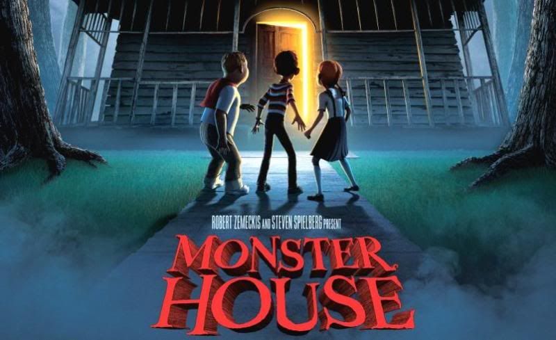
The appearance of the title backs up my previous speculations as it is clearly a childrens horror film due to it's use of crooked, disproportionate letters to give it a creepy feel. However it is still quite clean and smooth giving the film a child-friendly appearance.
SCOTT PILGRIM VS. THE WORLD
The title of this film suggests an action packed, fantastical movie, due to its use of exaggeration and fantasy. The "vs" suddgests that the character faces alot of challenges in the film and that it contains alot of conflict.
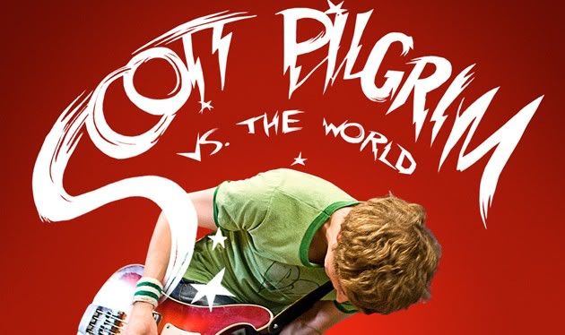
From the appearence of the title, I can verify what I got from the title. The film looks energetic with a rocky feel, due to the electric/lightening bolt text. The fact that "Scott Pilgrim" is in large letters suddgests that he is the key feature of the film.
VAMPIRES SUCK
Due to the obvious pun in the title of this movie, it is clear that this a comedy film, and due to the pun on the theme of vampires, it suddgests that this is a parrody on the recently common vampire genre.
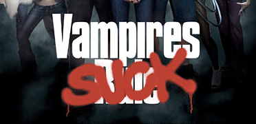
looking at the title, it is clear that this is a comedy film aimed at a young audience. The use of the spray paint over the original title: Vampires Rule, puts across an idea of anarchy, and makes the film seem rebelious for not obeying the common opinion of the film going public.
Before I look at the graphics I will analyse the title of the film to gain an understanding of word choice and phrasing in relation to genre and audience.
MONSTER HOUSE
The word monster sudggests that the film is directed at a young audience, as monsters are commonly associated with irrational childhood fears of fantastical creatures and comical characters. It is clear that this film is meant to be in the childens horror genre because of its use of the word monster.

The appearance of the title backs up my previous speculations as it is clearly a childrens horror film due to it's use of crooked, disproportionate letters to give it a creepy feel. However it is still quite clean and smooth giving the film a child-friendly appearance.
SCOTT PILGRIM VS. THE WORLD
The title of this film suggests an action packed, fantastical movie, due to its use of exaggeration and fantasy. The "vs" suddgests that the character faces alot of challenges in the film and that it contains alot of conflict.

From the appearence of the title, I can verify what I got from the title. The film looks energetic with a rocky feel, due to the electric/lightening bolt text. The fact that "Scott Pilgrim" is in large letters suddgests that he is the key feature of the film.
VAMPIRES SUCK
Due to the obvious pun in the title of this movie, it is clear that this a comedy film, and due to the pun on the theme of vampires, it suddgests that this is a parrody on the recently common vampire genre.

looking at the title, it is clear that this is a comedy film aimed at a young audience. The use of the spray paint over the original title: Vampires Rule, puts across an idea of anarchy, and makes the film seem rebelious for not obeying the common opinion of the film going public.
Monday, 13 September 2010
Introduction to Blog
For our Year 13 project, as a class we were set a task to create a horror movie trailer. By using research of other films, analysis of trailers and various other methods of preperation, we will produce a horror movie trailer as a group.
Subscribe to:
Comments (Atom)


