Our group is made up of three members, Alex Perez-Davies, Dan Rodriguez Reeves and me. As we are being set a large task, we decided to split ourselves up and allocate each other separate tasks in order to reach our goal and make it easier to complete the task. Even though we were set different tasks, we will still help each other with their individual tasks, and we will still work as a unit.
Team Members:
Alex: aperez-davisabs@blogspot.com
Dan: danrodriguezy13coursewrok@blogspot.com
Monday, 27 September 2010
Thursday, 16 September 2010
Words or Visual
Following the research i did previously on analysing film titles and film title graphics, I am going to breifly discuss which i think is more important, the word choice and phrasing of a film title or the visual aspects of the film title.
I believe that it is the wording that contributes more to the communication of genre and audience to the viewing public, as a lot of the time the movie title is a clear indicator of genre but more importantly storyboard, something that the visual aspects of a title could never do. Typography, arrangement, colour etc. can only reveal so much about the film, as they can only suddgest, not state. Also, a lot of the meanings and messages in the visual aspects of a film title will be overlooked by the viewer and therefore un-noticed.
I believe that it is the wording that contributes more to the communication of genre and audience to the viewing public, as a lot of the time the movie title is a clear indicator of genre but more importantly storyboard, something that the visual aspects of a title could never do. Typography, arrangement, colour etc. can only reveal so much about the film, as they can only suddgest, not state. Also, a lot of the meanings and messages in the visual aspects of a film title will be overlooked by the viewer and therefore un-noticed.
Film Title Research
In order to prepare myself for creating my own horror movie film title, i set out to explore the uses of typography, font, colours and graphics in other film titles and analyse the reccuring themes and conventions. I was also looking for relations between the appearence of these titles and their genres.
Before I look at the graphics I will analyse the title of the film to gain an understanding of word choice and phrasing in relation to genre and audience.
MONSTER HOUSE
The word monster sudggests that the film is directed at a young audience, as monsters are commonly associated with irrational childhood fears of fantastical creatures and comical characters. It is clear that this film is meant to be in the childens horror genre because of its use of the word monster.
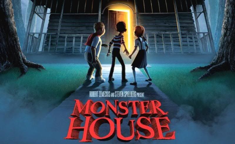
The appearance of the title backs up my previous speculations as it is clearly a childrens horror film due to it's use of crooked, disproportionate letters to give it a creepy feel. However it is still quite clean and smooth giving the film a child-friendly appearance.
SCOTT PILGRIM VS. THE WORLD
The title of this film suggests an action packed, fantastical movie, due to its use of exaggeration and fantasy. The "vs" suddgests that the character faces alot of challenges in the film and that it contains alot of conflict.
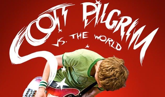
From the appearence of the title, I can verify what I got from the title. The film looks energetic with a rocky feel, due to the electric/lightening bolt text. The fact that "Scott Pilgrim" is in large letters suddgests that he is the key feature of the film.
VAMPIRES SUCK
Due to the obvious pun in the title of this movie, it is clear that this a comedy film, and due to the pun on the theme of vampires, it suddgests that this is a parrody on the recently common vampire genre.
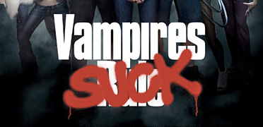
looking at the title, it is clear that this is a comedy film aimed at a young audience. The use of the spray paint over the original title: Vampires Rule, puts across an idea of anarchy, and makes the film seem rebelious for not obeying the common opinion of the film going public.
Before I look at the graphics I will analyse the title of the film to gain an understanding of word choice and phrasing in relation to genre and audience.
MONSTER HOUSE
The word monster sudggests that the film is directed at a young audience, as monsters are commonly associated with irrational childhood fears of fantastical creatures and comical characters. It is clear that this film is meant to be in the childens horror genre because of its use of the word monster.

The appearance of the title backs up my previous speculations as it is clearly a childrens horror film due to it's use of crooked, disproportionate letters to give it a creepy feel. However it is still quite clean and smooth giving the film a child-friendly appearance.
SCOTT PILGRIM VS. THE WORLD
The title of this film suggests an action packed, fantastical movie, due to its use of exaggeration and fantasy. The "vs" suddgests that the character faces alot of challenges in the film and that it contains alot of conflict.

From the appearence of the title, I can verify what I got from the title. The film looks energetic with a rocky feel, due to the electric/lightening bolt text. The fact that "Scott Pilgrim" is in large letters suddgests that he is the key feature of the film.
VAMPIRES SUCK
Due to the obvious pun in the title of this movie, it is clear that this a comedy film, and due to the pun on the theme of vampires, it suddgests that this is a parrody on the recently common vampire genre.

looking at the title, it is clear that this is a comedy film aimed at a young audience. The use of the spray paint over the original title: Vampires Rule, puts across an idea of anarchy, and makes the film seem rebelious for not obeying the common opinion of the film going public.
Monday, 13 September 2010
Introduction to Blog
For our Year 13 project, as a class we were set a task to create a horror movie trailer. By using research of other films, analysis of trailers and various other methods of preperation, we will produce a horror movie trailer as a group.
Subscribe to:
Comments (Atom)